

A part of my role as the principal UI/UX designer for our team with University Communications and Marketing is designing hero graphics for our SJSU homepage which can include social media campaigns.
Skills showcased:
• Illustration
• Illustration
• Typography
• Photo editing
• Reworking existing graphics
• Reworking existing graphics
Immigrant Heritage Month
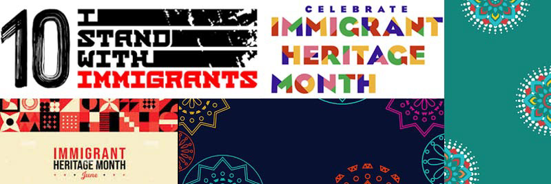
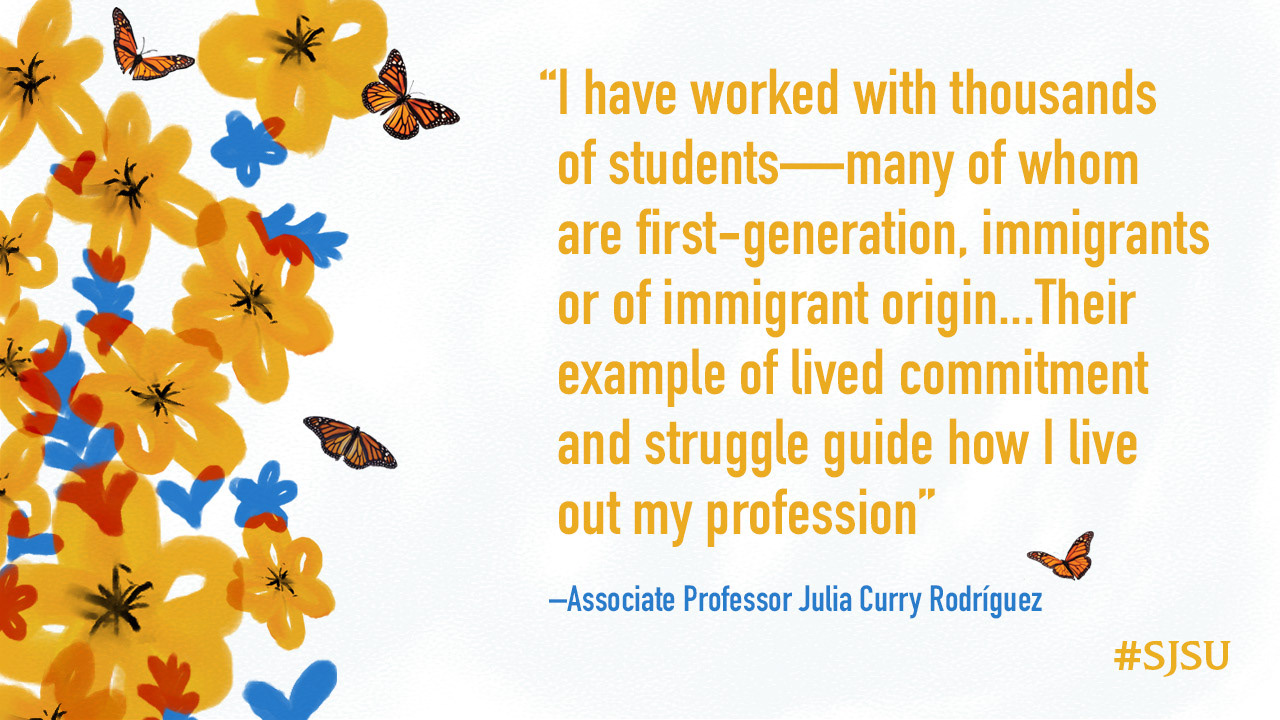
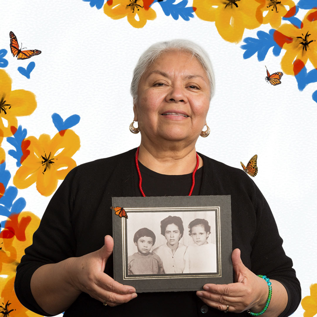
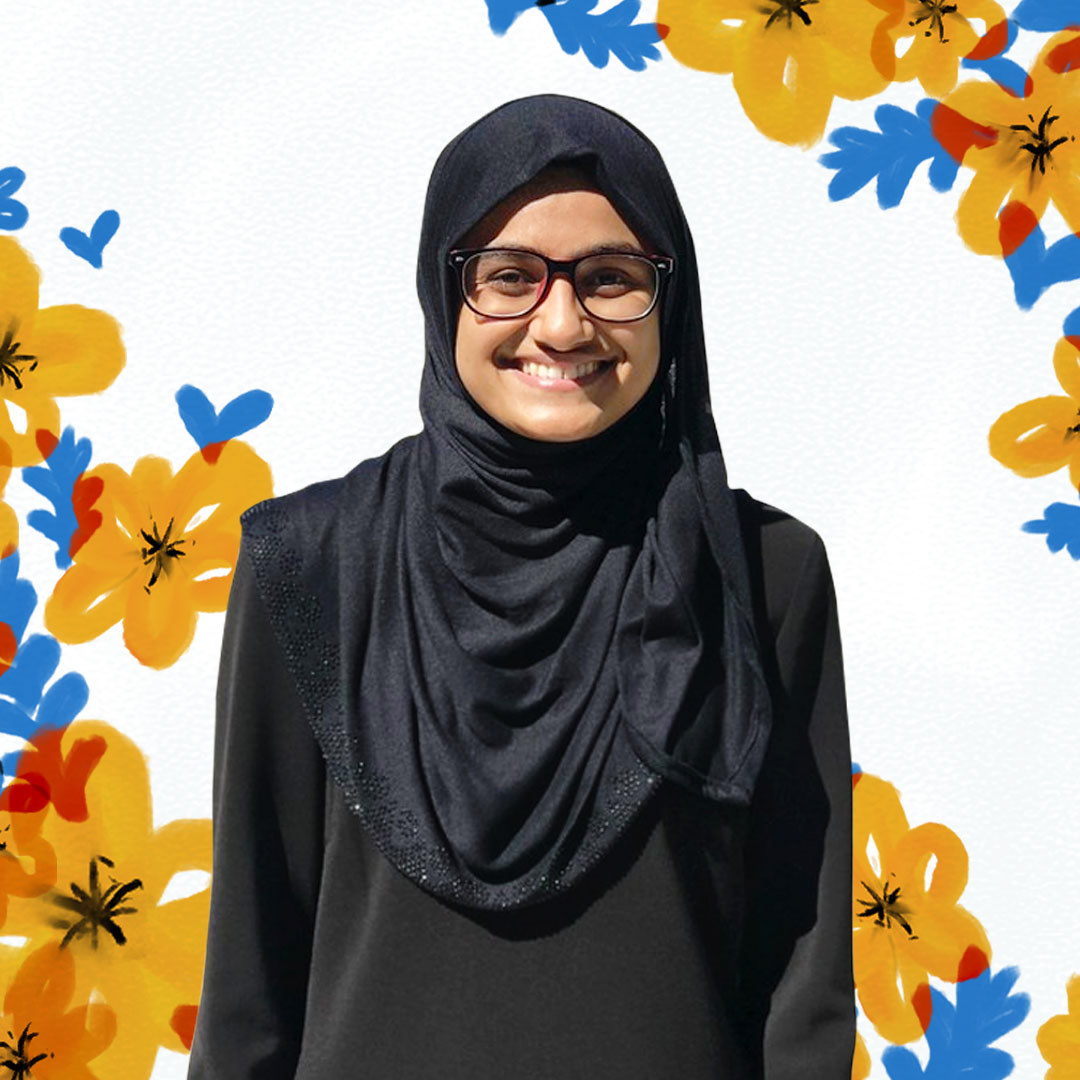
Each June, Immigrant Heritage Month pays tribute to the historical, societal, and cultural contributions made by immigrants to American history. In celebration, our marketing team contributed to the campaign I Stand With Immigrants, an initiative that helps amplify these stories that demonstrate how immigration is good for our communities, economy, and country. I was tasked with creating the theme and graphics to help promote each story on our blog and social platforms throughout the month utilizing their portraits and pull quotes.
Developing look and feel
I first researched to see what graphics had been put out already for the campaign. I found a lot of great takes with bright color-blocked typography and cultural vector patterns.
For the element/pattern, I decided to use flowers to represent the blossoming spirit of immigrants. When embraced and nurtured within a welcoming community, they bloom and enrich the nation's cultural landscape. To tie into the campaign, I settled on a brighter color palette that pulled in red and black as secondary accents to our SJSU gold and blue.
To play into this theme and create something different from what I have seen, I decided to go into a more organic and handcrafted feel by using Photoshop's watercolor brush effect. With additional elements of leaves and hearts added, I applied a blending mode that created tints of red in the areas where the elements overlap.
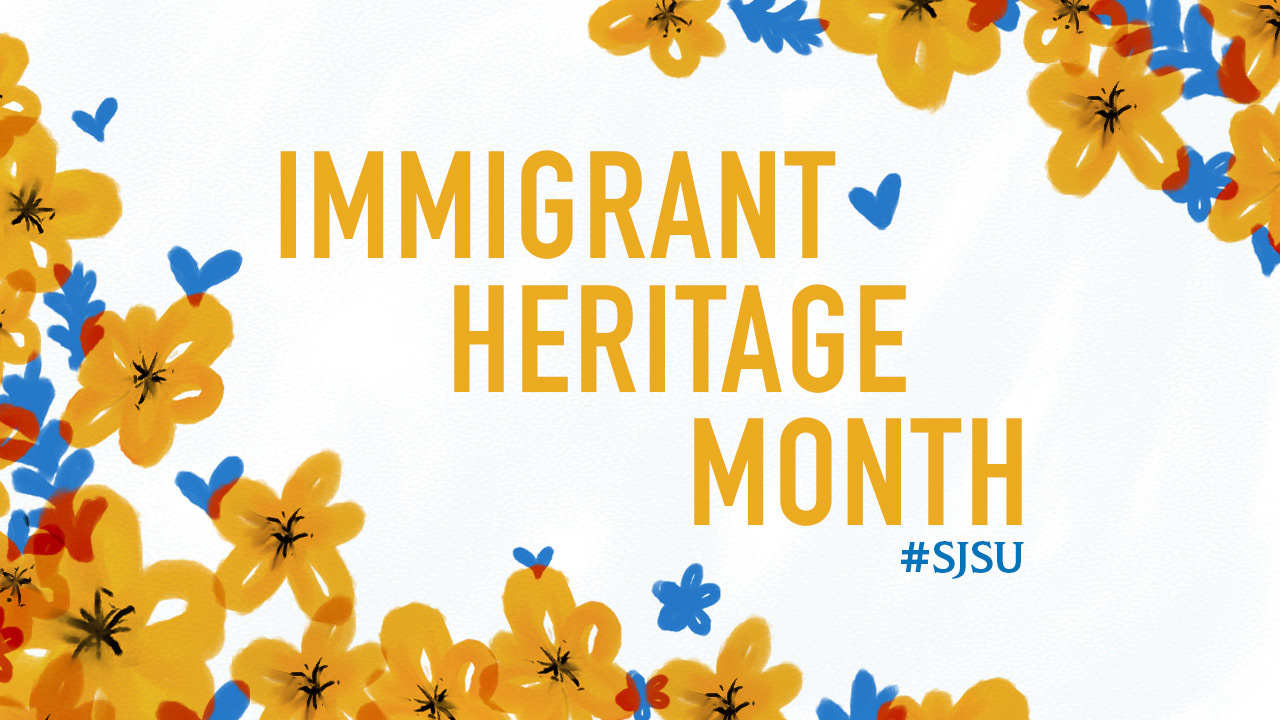
With these elements, along with a light textured white background, I was able to create a set of graphics that highlighted our people and quotes in a bright and celebratory way.


Black History Month
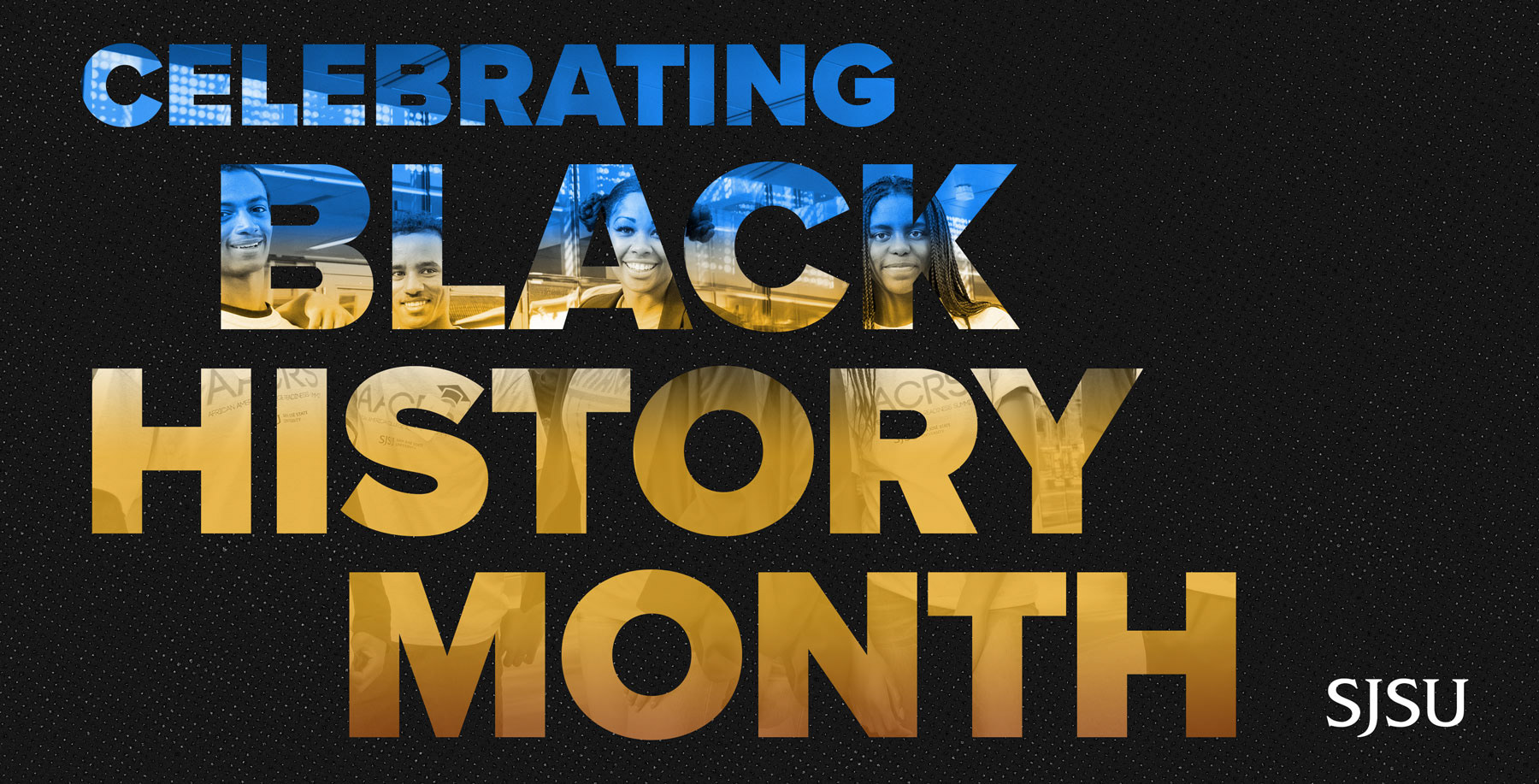
Every year, San José State honors Black History Month by offering events, speaker series, workshops and lectures that recognize Black and African-American heritage, cultures and contributions to society.
Developing look and feel
To promote these events, I faced the challenge of crafting a hero graphic featuring a timeline that demanded a one-day turnaround. This tight deadline arose as our team was diverted to high-priority projects during this period.
To make sure I executed this in time, I knew I had to focus on creating a clean and simple typographic-centered graphic. To add interest, I pulled a wonderful photo of our Black Leadership and Opportunity Center students to peek through the letters. To achieve this, I had to carefully clip certain areas, ensuring that the faces appeared in a place that played with the negative space of the letters without an awkward obstruction.
SJSU Athletics: Summer Olympics in Tokyo
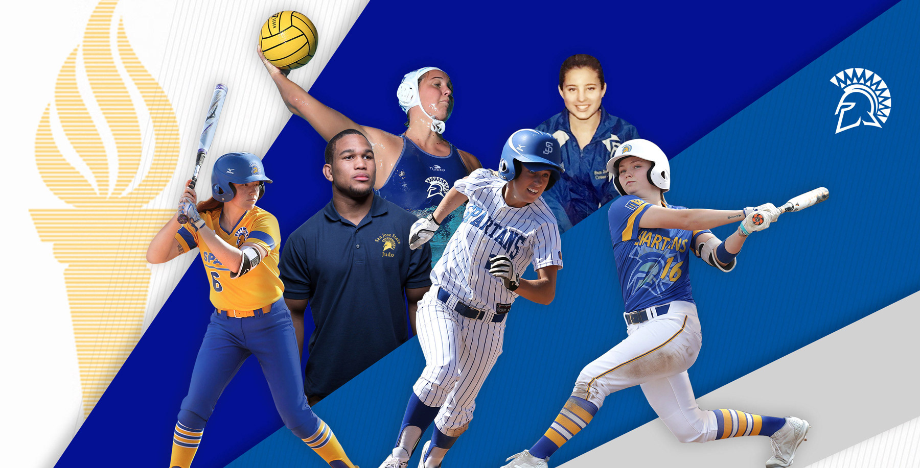
San José State has been a part of nearly every Olympics since 1924. To celebrate the university being represented in the Summer Olympics in Tokyo, we pushed out a news story on the homepage.
Developing look and feel
For the hero graphic, which also had a tight turnaround, I decided to leverage previous assets generated by our team that used much of the Athletics' graphics of angled lines and use of textured patterns but retained much of the university's style with a more minimal and collegiate look. The main focus of the graphic would be the seven former Spartans participating and the Olympic torch.
The main challenge I faced was placing each subject in a position that played well with one another and flowed naturally around the space between each other.
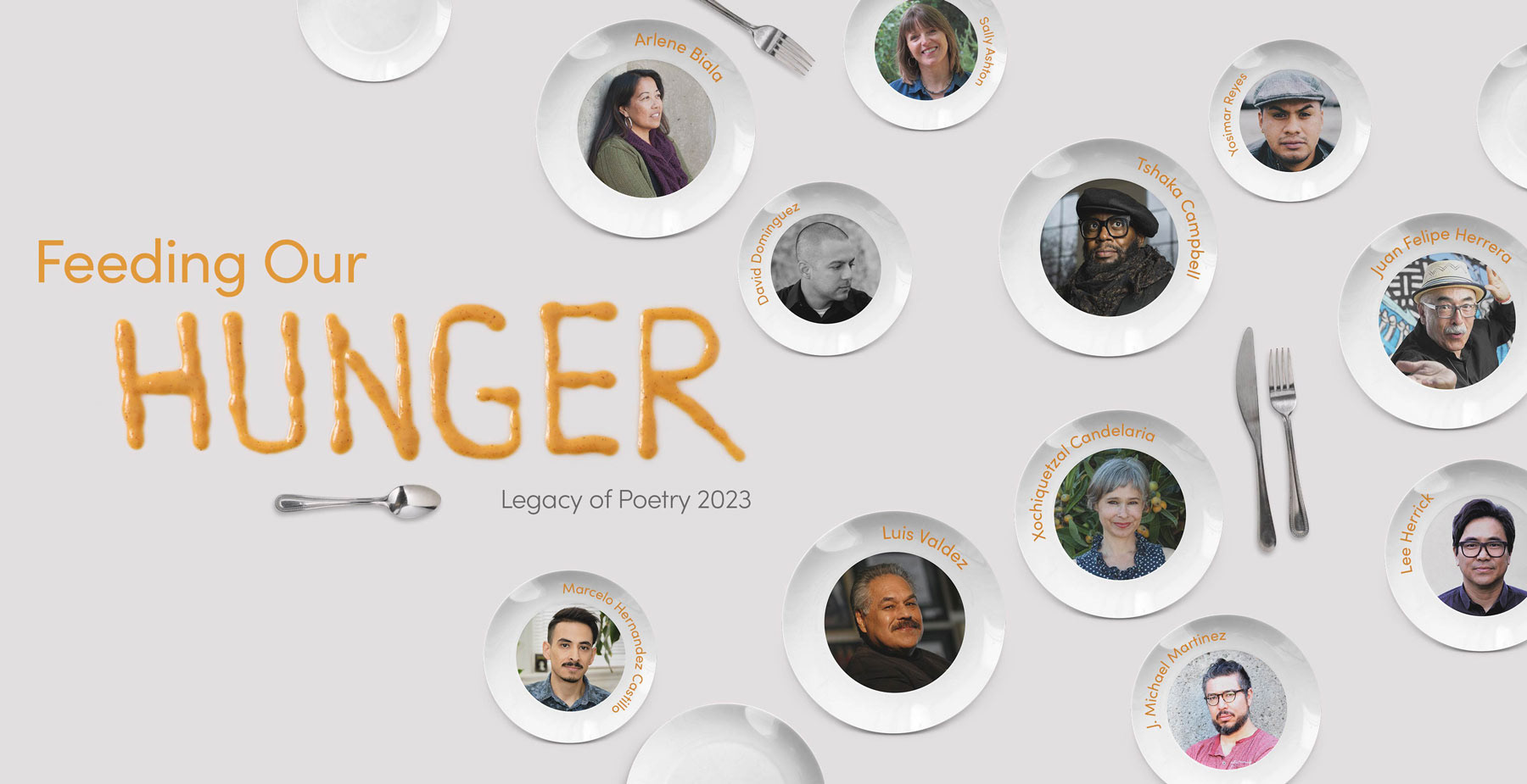
Legacy of Poetry Fest: Feeding Our Hunger
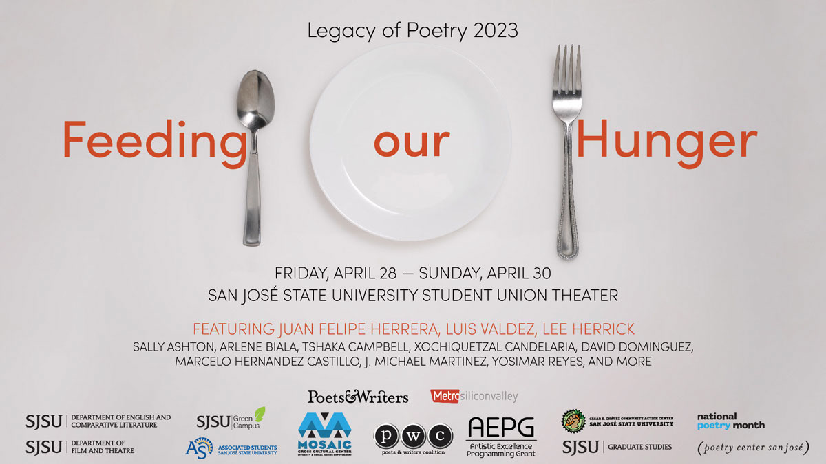
SJSU's Annual Legacy of Poetry Festival features nationally prominent poets and poets from SJSU and the South Bay community. It was a great space for students to share their work, support one another, and network.
Developing look and feel
For the homepage promotion of the event, I was tasked with working with the pre-existing assets to create a more minimal and impactful promotional graphic.
Pre-existing promotional graphics
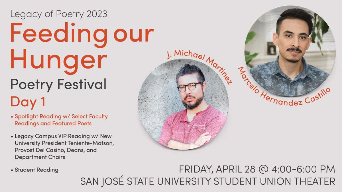
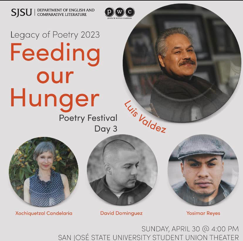
I utilized the portraits of the writers, the clipped plates and cutlery as well as some typography treatments their team experimented with by using condiments. This offered a really interesting focal point to the graphic. With the plates, I scaled down the portraits so the plates could still be visually recognizable. This allowed me to continue to integrate the elements by placing their names around the rim of the plate. From there I played with the space by creating various sizes of the plates and the utensils playfully appearing in different angles.
Commencement: Spartans Shine!
When creating the post-congratulatory homepage hero, I dug into our photography folder to find potential images that reflected the joy and excitement of the graduation ceremony.
While considering our theme of "Spartans Shine!" for this particular event, I came across two photos with fantastic lighting that perfectly highlighted the sparkling background. However, the challenge I faced revolved around the expressions of the subjects. While some were engaging, others seemed a bit awkward.
Original selected photos
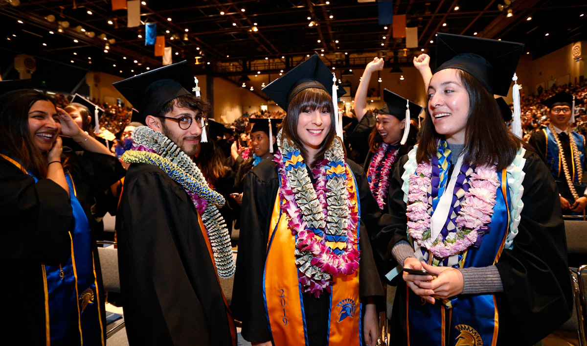
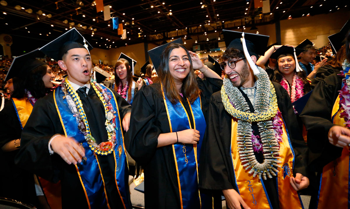
Using Adobe Photoshop, I clipped the center subject on the left photo, who had great eye contact with the viewer and decorated in grad leis. The subject was then strategically placed into the right photo, replacing the left individual whose expression felt awkward, and worked on blending the elements around them. I then enhanced the background lights by cloning them, amplifying their radiance to beautifully complement the overarching theme of our graduates shining brightly.
Final exported photo
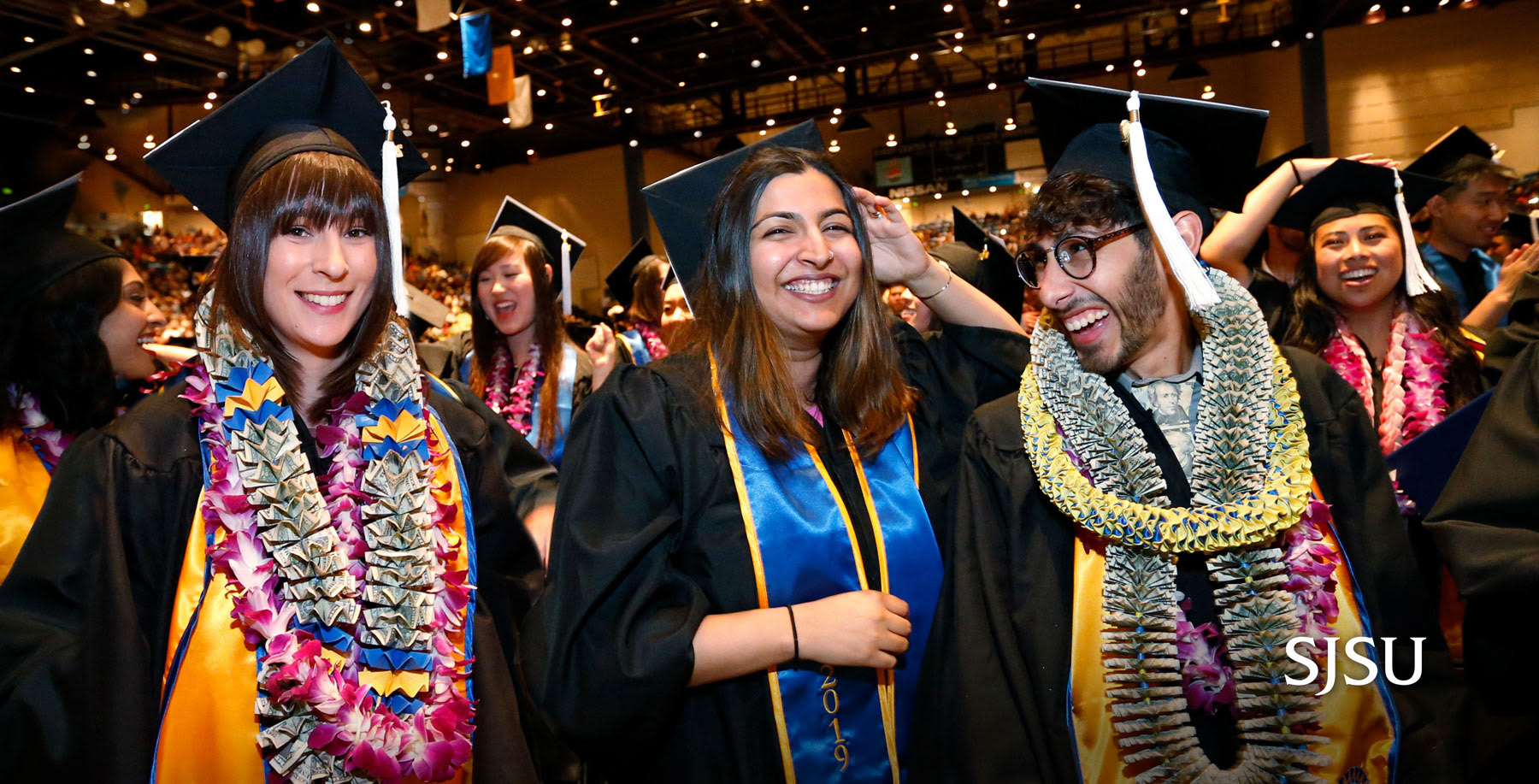
Our new graduates now “sparkle with light” and are well-equipped to brighten our future: their own futures, the futures of their families and the futures of all of society. We look to them, the new graduates of San José State, to help us make our way out of the darkness. And I know they will do just that.