

Core Team: Christina Olivas, Digital Director; Brenden Sparks, Front-end Developer; Monica Bosque, Web and UX Designer
My Role:
• Conducted interface inventory of sjsu.edu
• Executed a comparative analysis of other universities at the component level
• Developed wireframing of components
• Built top-level pages utilizing new templates and components for first phase of launch
• Conducted interface inventory of sjsu.edu
• Executed a comparative analysis of other universities at the component level
• Developed wireframing of components
• Built top-level pages utilizing new templates and components for first phase of launch
Problem
San José State is known as the most prominent urban public university located in the global center of technological innovation. Yet our digital campus was not reflective of who we are and where we are. Our ecosystem consisted of over 400+ sites that lived on static, non-responsive web pages. This had to change.
Solution
Develop a mobile-first, accessible, and modern website redesign that bridged the gap of our current and ever-changing digital landscape. This would be a huge leap towards strengthening an important recruiting tool that garners 2.4 million pageviews each month and is reflective of SJSU as an essential partner in the economic, cultural, and social development of Silicon Valley and California.
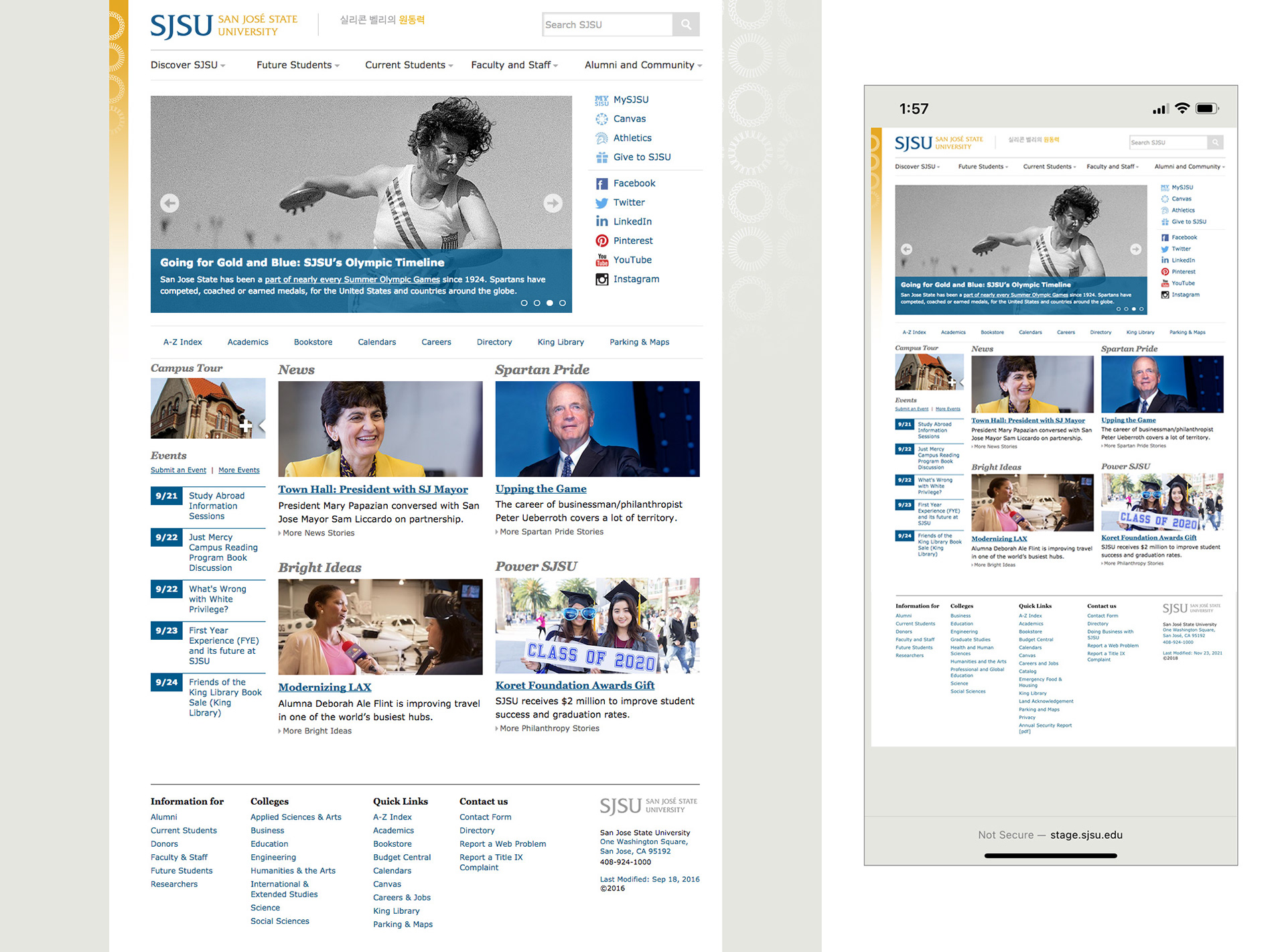
San José State University's 2019 homepage on desktop and mobile view.
Methodology
Our team reframed the way we thought about the project by moving away from wireframing full pages with content and focusing on designing systems of components that can be used to build the pages. This methodology is called Atomic Design, which begins the design process from the ground up, focusing on elements like headings, buttons, and labels.
Process and research
To begin this process we first conducted a content audit in conjunction with an interface inventory of our top-level pages. I analyzed over 70+ SJSU websites collecting samples of different elements and designs, showcasing not only inconsistencies but also common patterns that emerged from the audit.
After the audit was complete, I completed a comparative analysis at the component level of other universities to see how others were addressing different types of content.
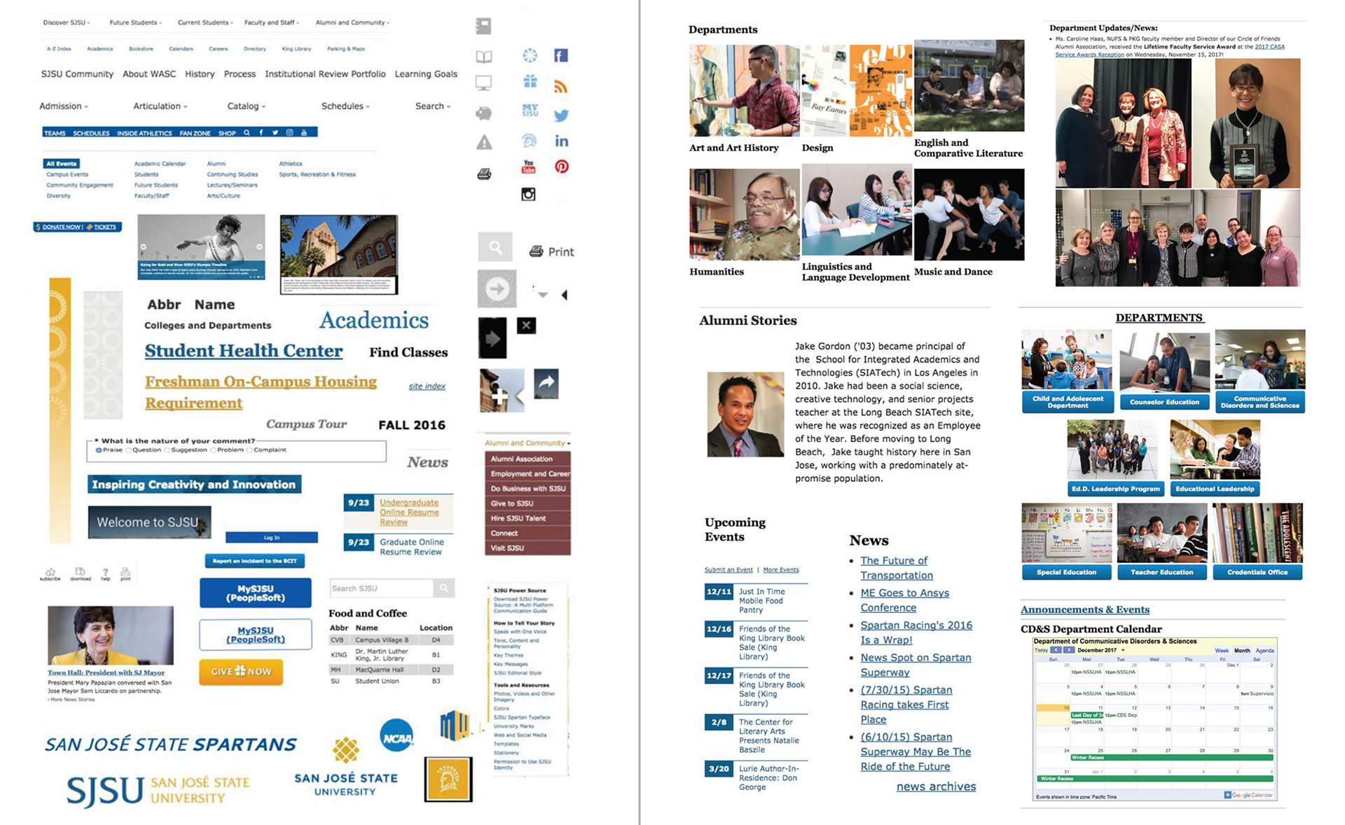
A snapshot of the different elements and design patterns found all throughout the audited SJSU websites. This revealed how disjointed and inconsistent our site was as well as common types of content our site owners posted on their pages.
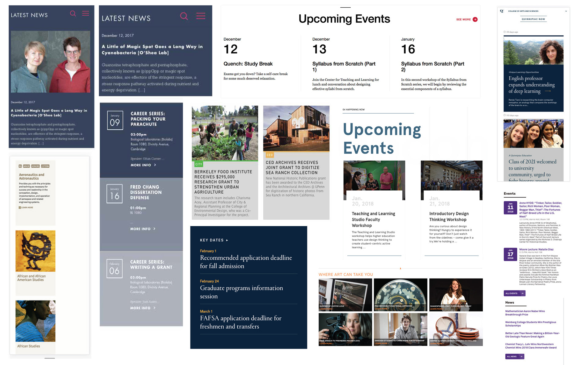
A comparative analysis helped reveal how other universities were addressing different types of common content such as announcements, events, student/faculty profiles, and department listings.
Wireframing Components
Based on the common designs and patterns that emerged from both types of audits, we began designing element collages to show what some of the interface elements would look like when our brand is applied while keeping in mind the methodology of Atomic Design.
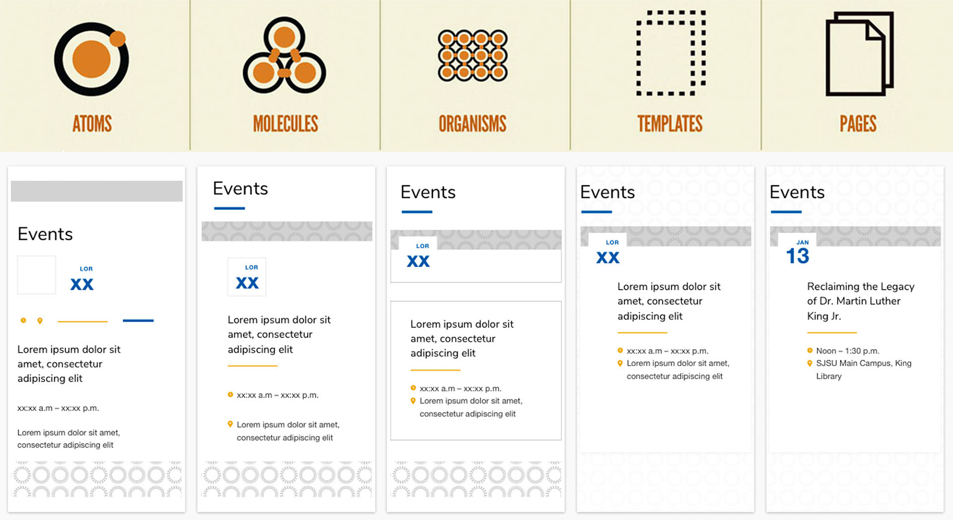
A listing of events was one of the common patterns that surfaced during the audit. We thought about the design of the different atoms that would make up the template of our calendar component.
One of the challenges we had to think about is how these components would grow, shrink and stretch as well as how users would utilize them. Some questions we asked ourselves during our design iterations is how would it work with and without an image? What if the image is low-quality and small? What if they add a lot of text? What happens when they don't include a headline? Or just a headline and no copy?
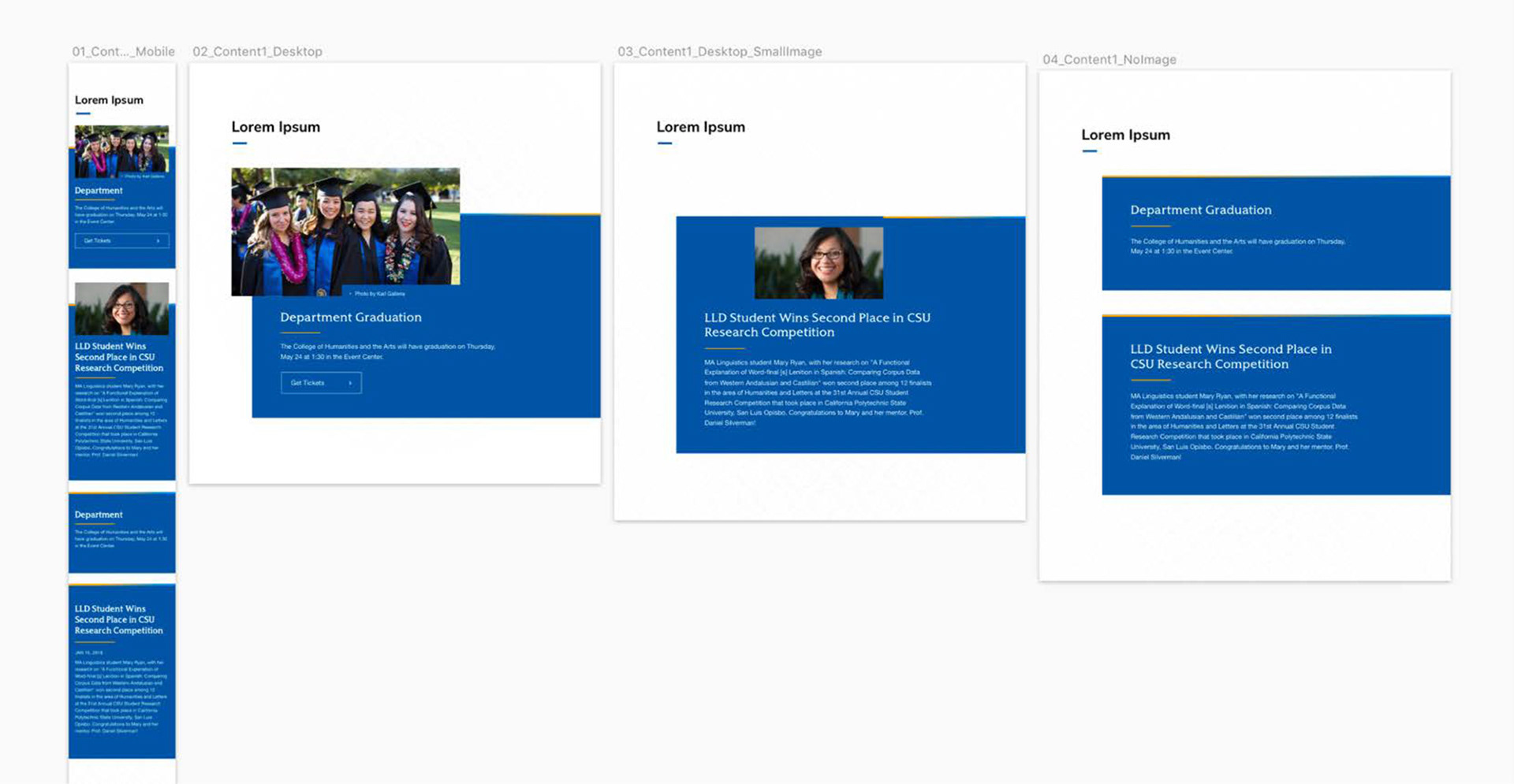
A UI mockup exploration of our feature component in mobile and desktop view.
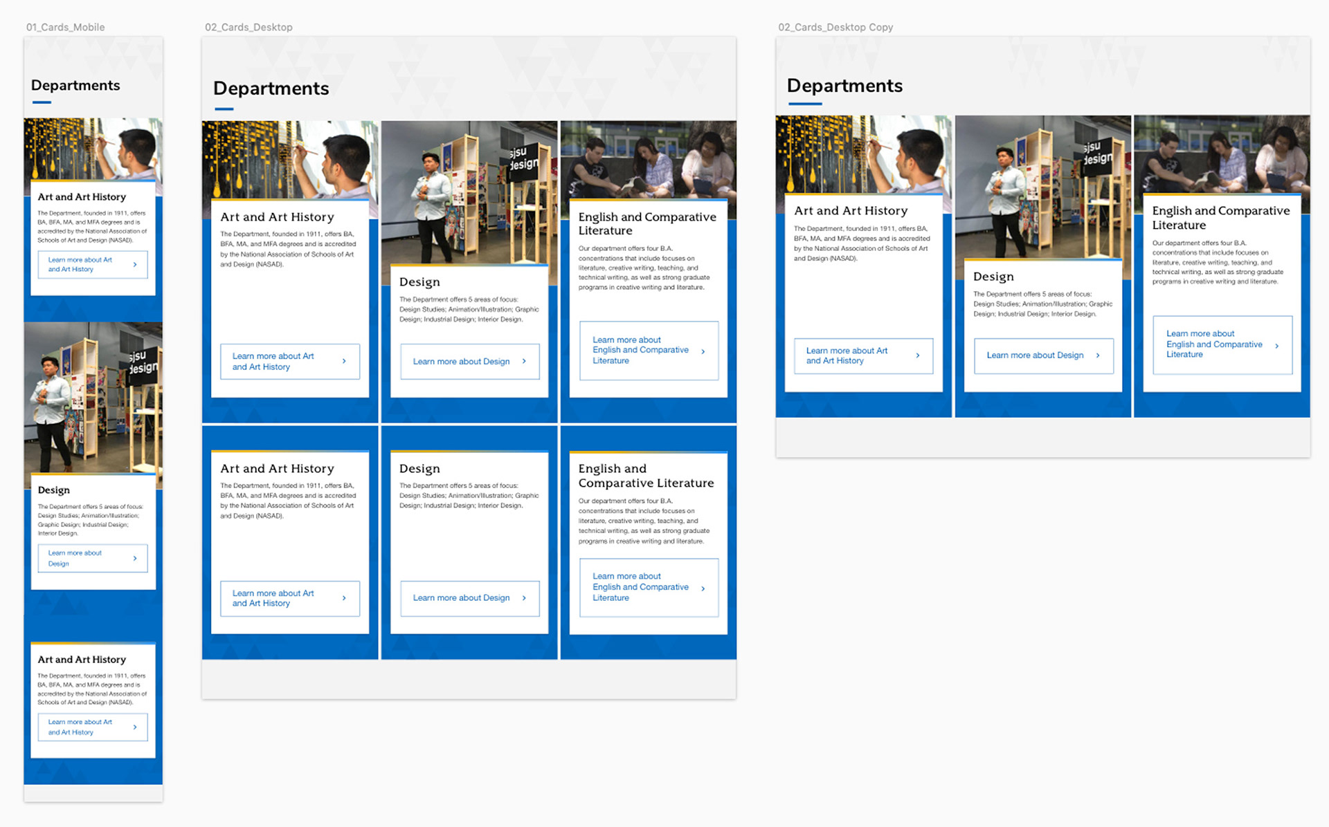
A UI mockup of our card component demonstrates the snippet's flexibility in adding and removing cards as needed.
Building out pages
The last step was to build pages with real content to see how the components interact together. This allowed for two things: continued iteration in a collaborative effort with our front-end developer to help determine decisions such as spacing, background colors, and hover states; and visually showing stakeholders how all these pages look like and exist in the current structure of our website ecosystem. This allowed for a lot of important conversations to take place with stakeholders as well as our graphic designers, writers, and other folks around the office who walked by and offered feedback.
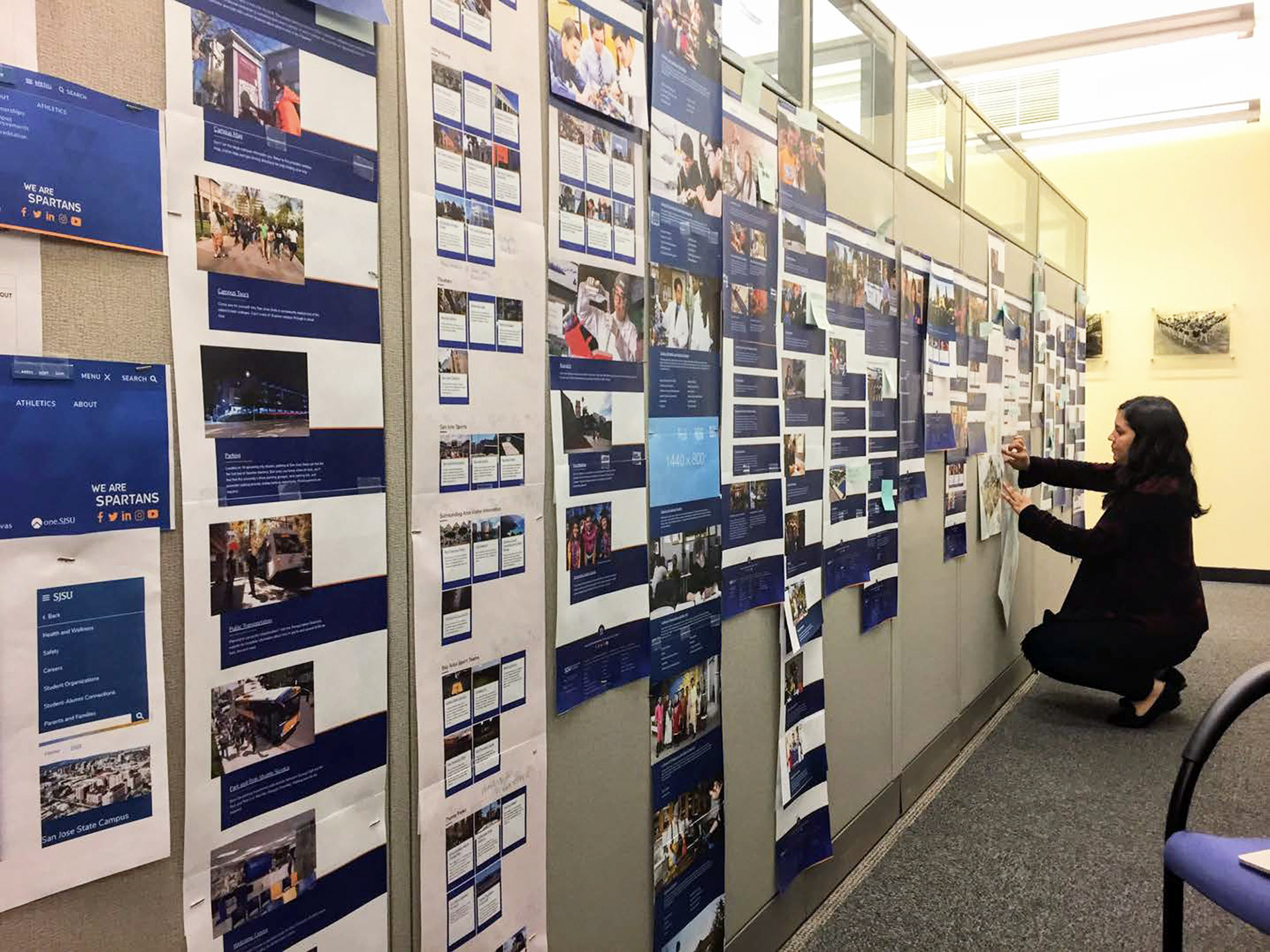
The design alley in our office where I am seen pinning all the print outs of our top-level pages. This promoted lively discussions.
Left screenshot shows the Safety top-level site in 2019; Right screenshot shows the newly migrated Safety site.
In collaboration with our writers, we focused on refreshing and developing content and imagery for the top-level pages of SJSU. Our landing page helps present key pieces of content on a high level with the option to add calls to action that are of the most importance to our users when visiting this page.
Impact and Takeaways
The new website redesign has significantly enhanced the user experience for our community and prospective students. Through a mobile-first approach and responsive design, the website now provides a seamless browsing experience across devices, allowing users to easily navigate and access information.
Despite the limited resources available to our team, the template redesign and new components represented a significant step forward in the right direction. With the launch of our top-level sites and pilot sites, we were also able to demonstrate to our site owners and content contributors how we can better deliver our content to our users while showcasing the exceptional work taking place on campus and beyond.