Core Team: Monica Bosque, Web and UX Designer, Alice Nguyen, Assistant Director of Web, UX and Content along with close collaboration with editorial and creative team.
My Role:
• Developed the "brand kit" defining the digital magazine's visual identity
• Designed the core templates and component blocks
• Built out and designed the final pages that are optimized for mobile view
• Managed organization of creative assets and exports for archiving
• Designed new creative assets as needed along with photo editing and optimization for web
• Designed a new and updated email template for promotion
• Gathered and delivered analytics reports for web and email performance
• Gathered and delivered analytics reports for web and email performance
Project overview
SJSU's WSQ magazine is printed twice a year along with a digital version, targeting alumni and friends of SJSU. In 2020, the COVID-19 pandemic paused the print production of the magazine. In 2021, with production now possible again, the University and Marketing and Communications team aimed to take this opportunity to reimagine the magazine's branding along with a new, visually appealing and interactive digital platform. The aim was to continue to inform and delight Spartan alumni who have been a key Washington Square audience while, at the same time, engaging our broader community — and cultivating new supporters who wish to learn about all the ways we are transforming higher education and serving our students.
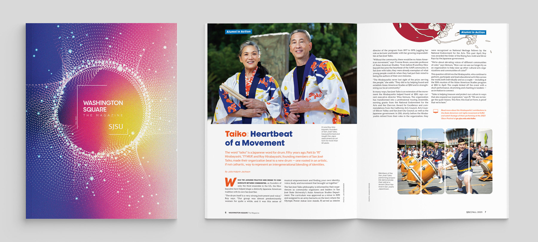
The Fall 2023 edition of Washington Square: The Magazine. The cover and inside spread showcase how a bright color palette is used prominently used throughout the magazine.
New platform, new opportunities
The digital magazine was hosted on our campus press blog platform using a customized template. Although the platform offered many benefits such as searchability with tags and categories, the team wanted to have more flexibility in terms of design and features that offered more of a visual impact for our viewers. With our needs and requirements in mind for the new platform, our team decided to purchase Foleon. This platform offered a page-turning interactive format, flexible and customizable templates, interactive elements, and collaboration features. Most importantly it also offered a responsive and accessible experience.
Developing a new visual identity
With the new platform in place, our next step was to our brand kit. One of the first things we did not want to do was replicate the style of the printed magazine. With a digital format, we needed to choose typography and colors that were web-friendly, and accessible yet still represented the magazine by marrying tradition with the new.
Typography — combining the traditional with the new
One of the first things we looked at was the web style of sjsu.edu — with the launch of our brand new templates not too long ago, we wanted to pull our new web font Nunito Sans as our header style. Representing the new.
For paragraph style, we wanted to pair our Nunito Sans with a more classic sans serif. In experimenting with many choices, we ended up with Georgia. Georgia is a classic font that offers great readability with its clear and well-defined letterforms which make it easy for readers to consume at an 18px scale without straining their eyes. Representing the tradition. Part of retaining tradition was bringing in our university's custom typeface, SJSU Spartan. A typeface that works wonderfully in large to medium display, we decided to pepper touches of this font with our block quotes.
Overall, we felt like our pairings created a nice balance between a modern and formal style.
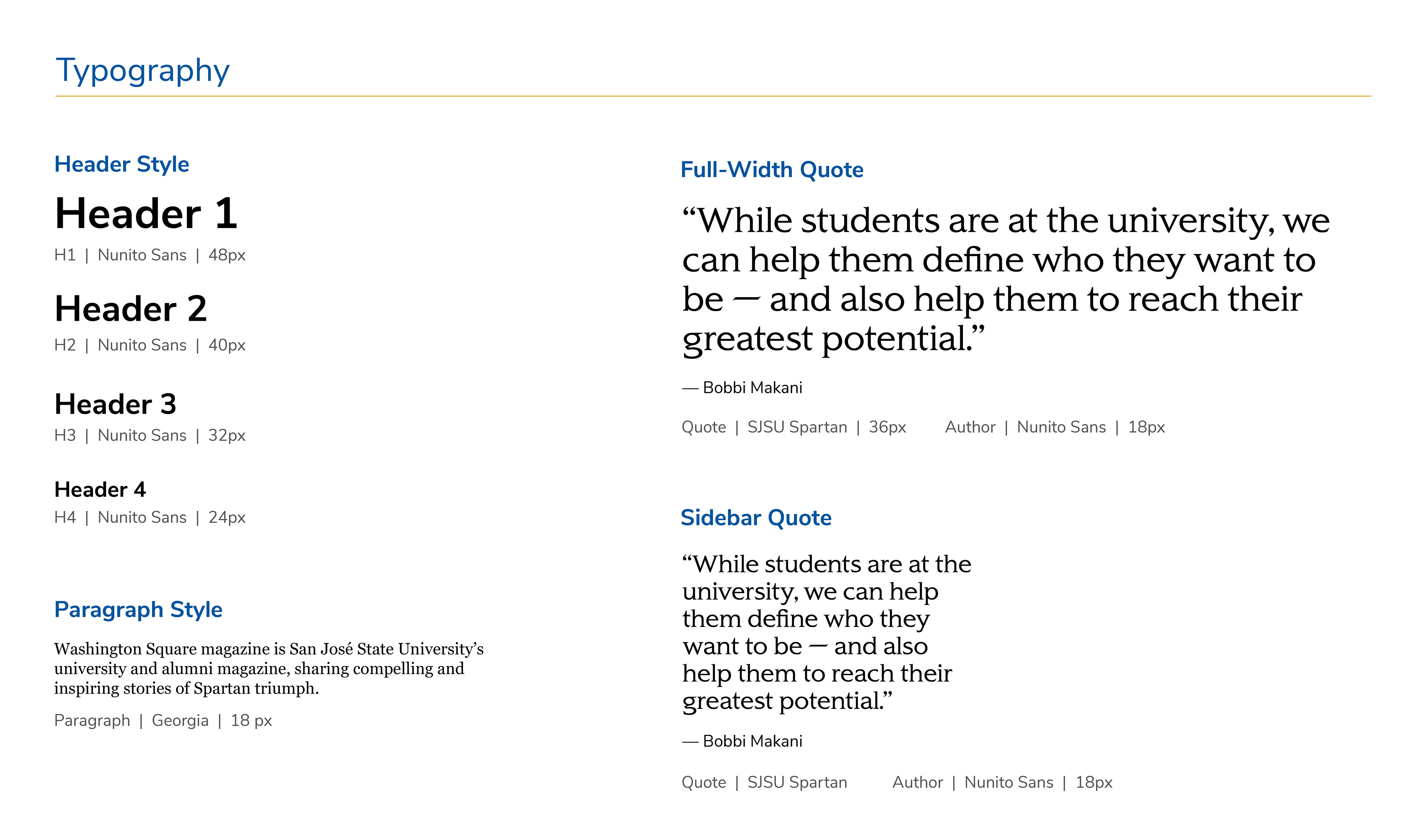
Typography style for the digital magazine. With the H1 header size in place, we scaled down the remaining headers by increments of 8 pixels. For paragraph style, we chose 18px which is considered a good scale for both desktop and mobile because it offers a comfortable and accessible reading experience.
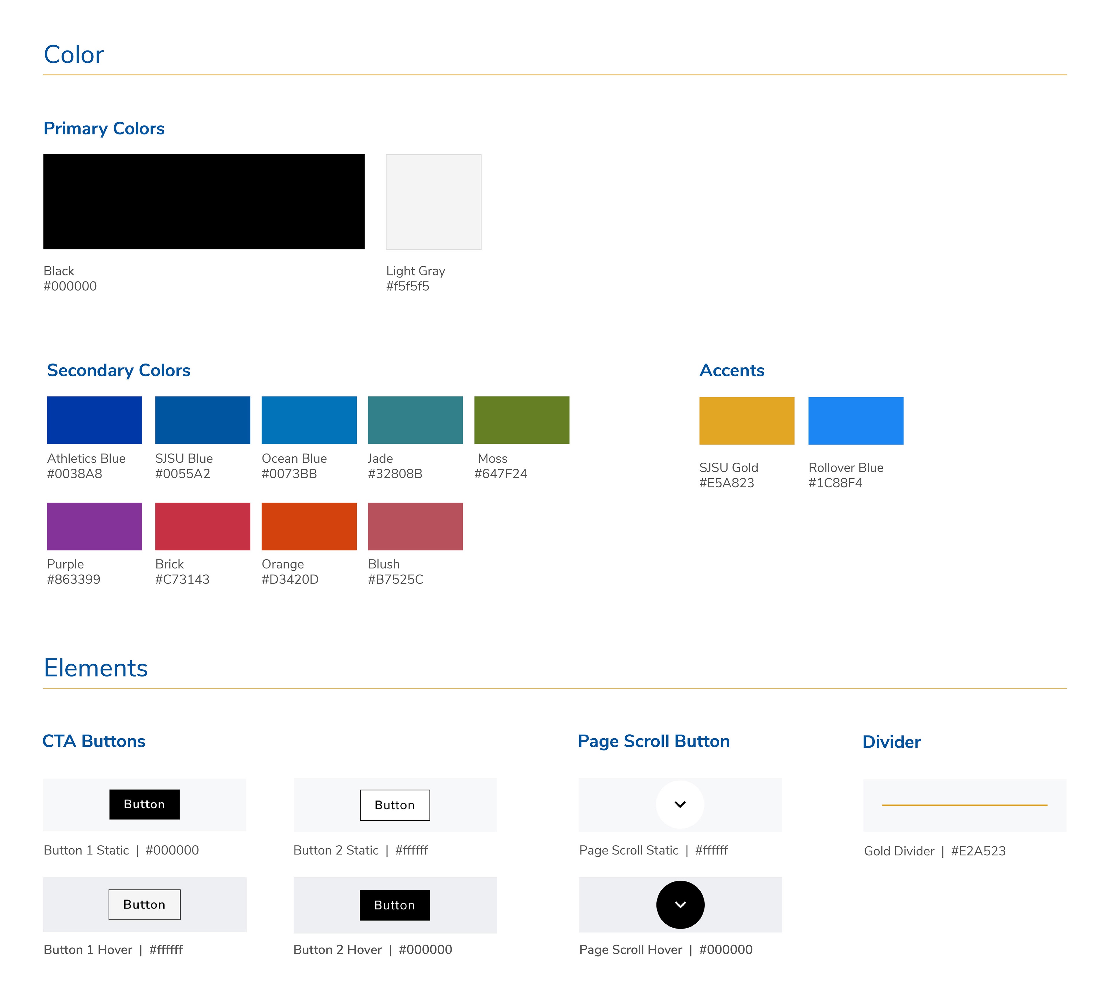
Curating an accessible color palette
For the magazine's first edition, we experimented with keeping most elements black such as typography, buttons, and navigational elements along with a light gray to add as a background color to break up certain sections. The aim was to allow the color of the photography and graphics to shine through. But as we continued to the next edition, we decided to incorporate the bright secondary color palette utilized in the printed magazine for a more consistent look and feel.
The printed magazine used a wide range of colors. So I aimed to select a few cool and warm shades. One of the main things I kept in mind is accessibility regarding application. To address this, I used the WebAIM color contrast checker tool to see how much I needed to adjust the shade so it could be used for headings as well as background colors with white text.
Designing a flexible system
Once the brand kit was established, the heavy work of designing the templates and blocks began.
The first block I designed was the hero. Tapping into my previous experience of curating the blog version of the magazine, I knew that with the digital edition of the magazine, some stories would have high-quality and impactful imagery to work with and others would have only a few selects that would not work well as a full hero feature. So I aimed to create a few versions that allowed that flexibility.
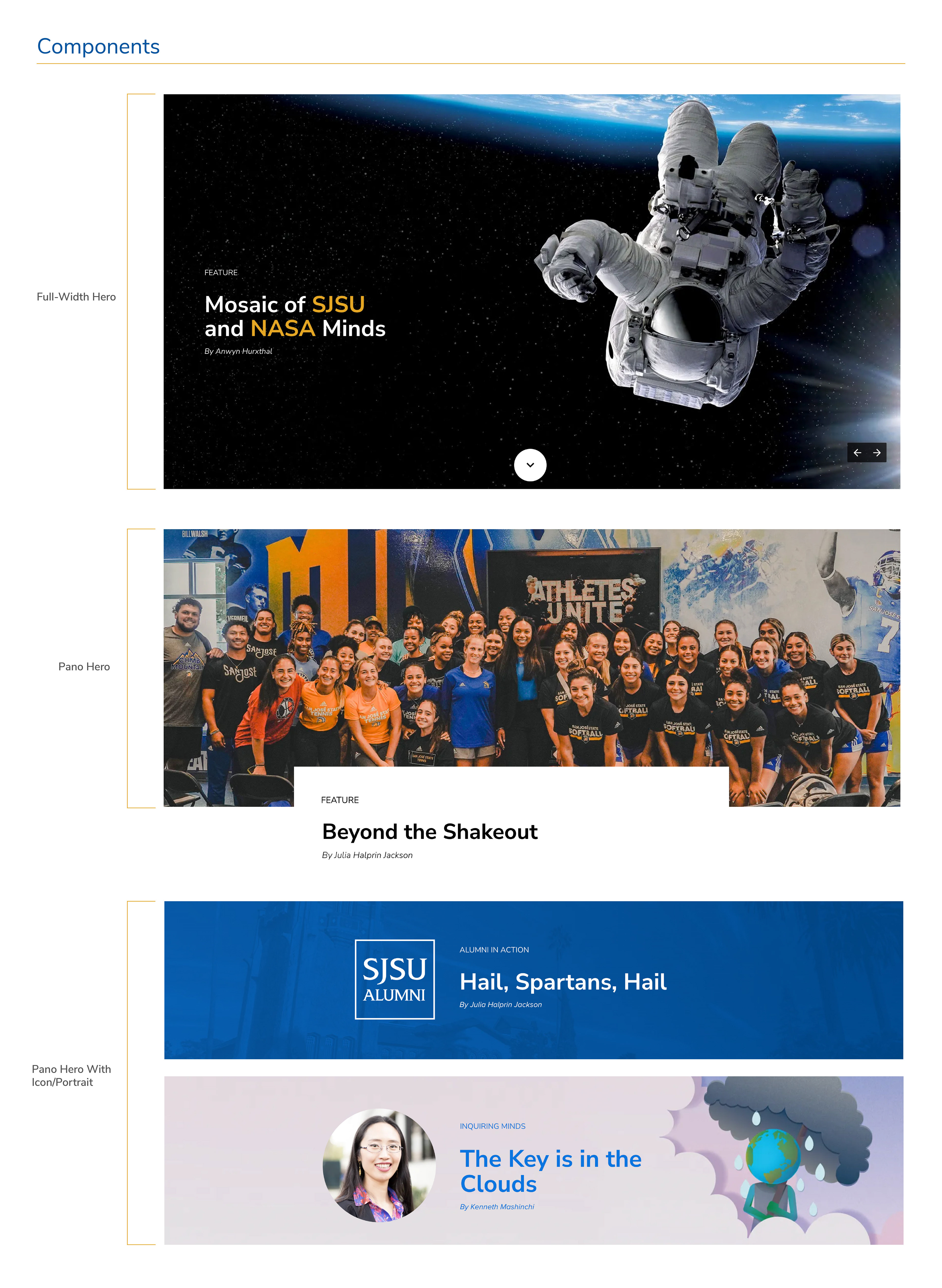
From the standard full-width hero, I created a pano version with an alternative pano that could display just the title with the option of an icon or portrait. This allowed me the flexibility to choose the component that worked best with the assets I had to work with.
From there, I focused on the following three additional blocks:
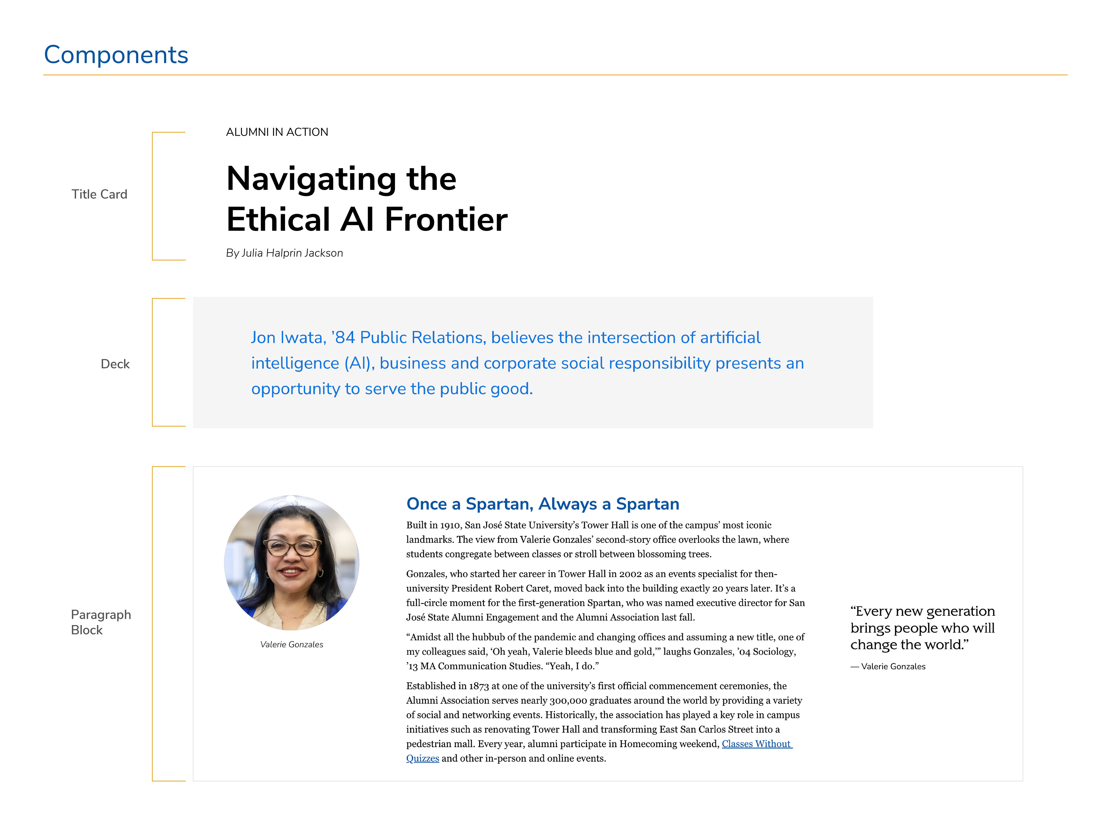
1. Title card: displays the category, story title, and byline. I defined the styling of each element and its proximity allowing it to anchor itself within the space of a hero component or right below a pano hero.
2. Deck: a short introduction of the story which is displayed after the headline. To differentiate this block from the main body copy that followed, I increased the font size to 24px and increased the padding around the block along with a light gray background color.
3. Paragraph block — I defined a set width that offered the most comfortable reading experience on the desktop, which was around 40-75 characters long. This also offered space for left and right sidebars. These sidebars provided placement for additional elements such as photography and small blockquotes.
A two-column variation of the paragraph block was also added for additional flexibility. This also allowed imagery or video to sit next to a block of text when needed.
From there I was able to continue to create components that were important to help break up the blocks of text. A few examples are:
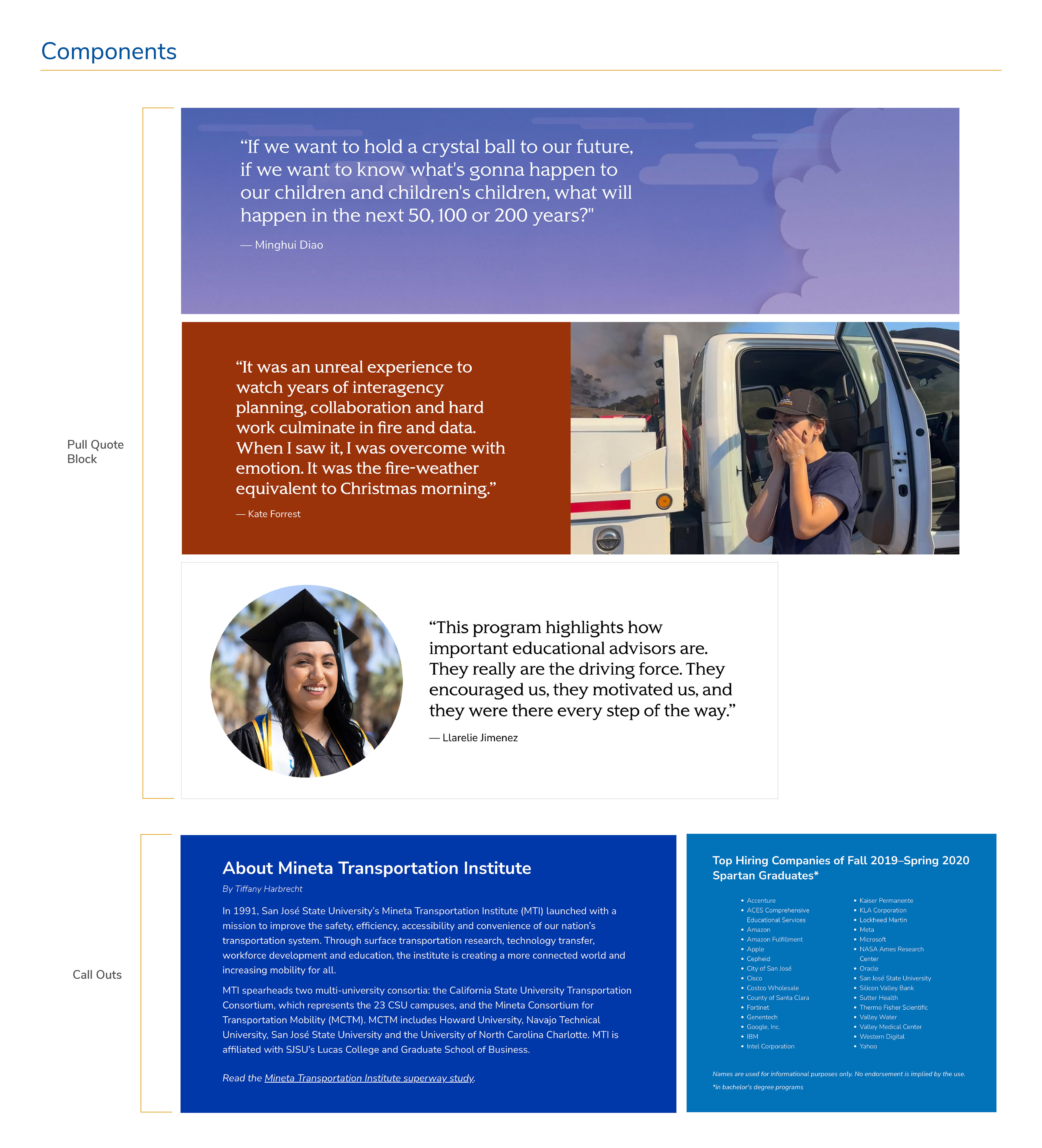
1. Photography: Blocks that can be pulled to display a large one-column photo (tall and pano) along with two and three-column photos.
2. Blockquotes: offering a few designs, from full width to two-column with photo and a version that can folded in between blocks of text.
3. Callouts (or sidebars): at times, additional information or a side article is featured within a story. This block was flexible with the selection of the background color and width depending on where it was nested.
These are only just a few examples of blocks that were created. As we developed new editions, new blocks and adjustments of current blocks were designed to increase the flexibility of the design for the magazine. Especially as new platform features are rolled out, we experimented and found ways to incorporate it into our system.
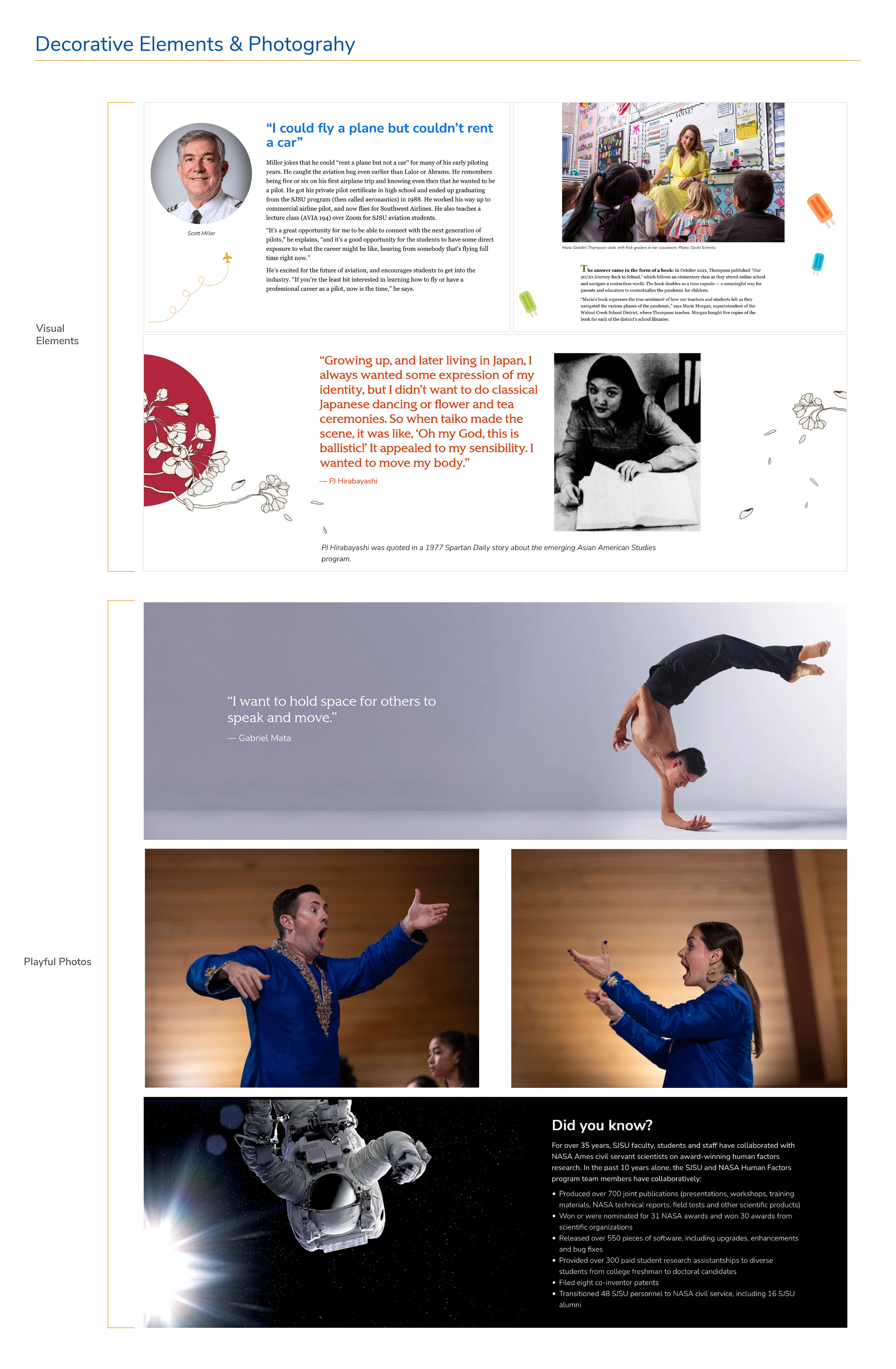
Adding playful and interesting elements
To elevate the magazine experience even more. I aimed to find ways to incorporate design elements you would find in the printed magazine. From small illustrations of planes to watercolor paintings of popsicles, finding strategic placements of these elements that move the eye around the space of the page added a pop of fun for the reader.
This also applied to photography. With the photos I have to work with in mind, I find sections or pull quotes within the story that can be worked with. From there I then experiment with editing or cropping the photos along with placement to create interesting moments.
This also can be amplified with features such as the animation (e.g. elements can animated to fade in) or with a parallax effect.
Final design
With the foundation in place, we were able to create templates that varied in design but overall still felt very unified and within the SJSU brand. We were excited about the new opportunities to flex and expand the ways we tell our Spartan stories online to our expanded audiences.
With four editions now produced, explore some of my favorite spreads!
Analytics and insights
The impact of the redesign was felt immediately. The first edition generated more than 31,000 page views in the first month and our team received dozens of positive comments submitted by alumni, campus community members, and others — confirming that the redesign was successful.
Additional specific data included:
• Average time on Foleon: 3 minutes and 14 seconds
• Pages/sessions: 6.53
• Bounce rate: 23.60%
• Total users: 2,955*
• Pages/sessions: 6.53
• Bounce rate: 23.60%
• Total users: 2,955*
*As of our last edition, we have reached a peak of 3,964 in total users.
In comparison to the 30-day performance of our last edition in 2019 (before the redesign) with total page views reaching 5.4K and a bounce rate of 74%, we increased page views by 474.07% and reduced our bounce rate by 68.11%.
Some of my favorite feedback from our readers
“Beautifully designed and crafted. Kudos to the team that made this possible. I'm an alumni '99 and my daughter is a Spartan this year too. Spartan proud! Well done and nicely executed.”
“Love the new look and the way you highlighted the College of Science with the articles on WIRC, the new Science Building and Dr. Alea. The magazine as a whole is easy to read, very colorful and the content of each article is informative and makes me proud to be a Spartan.”
“Nice, clean, user-friendly. Great mix of campus grounds and inspiring alums. Kudos to the staff! I look forward to reading upcoming issues.”
“Looks great! I rarely read digital magazines, but this layout was welcoming and it was easy to see which articles would interest me. Good work!”
Award-winning!
Our team was thrilled when we learned our first edition won the 2022 Best of CASE District VII, Award for an Online Magazine. CASE District VII represents professionals and institutions in the western region of the United States (Arizona, California, Guam, Hawaii, Nevada, Northern Mariana Islands, and Utah).